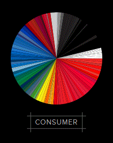
I've been having fun with the visually-striking infograph Profitable Colours. Go here. It classifies company logos by colour, then ranks them according to worth, stock performance, and sorts them into industries.
Finance companies tend to be blue while consumer goods logos tend to be red. I wonder why.


Comments
Post a Comment