I've been teaching myself a Javascript visualization library called D3. It gives the chart creator an incredible degree of control in making interactive web-based charts. My previous interactive charts, including my interactive Eurosystem balance sheet tool, have all used the Google Vizualization API, which is far less powerful than D3.
You may want to read my last post was on bitcoin alternatives in order to understand what I'm trying to get at in this post. In visualizing the cryptocoin market, I think it's important to convey information about both the relative size of each cryptocoin and the date on which it was born. In doing so I'm trying to illustrate how being the first mover engenders network effects -- early cryptocoins tend to attract the largest market share. I also want to capture the mini boom in new coins since May 2013. Below I've pasted a D3 visualization of this data. Users can interact with it by hovering the mouse over each circle. The code is here.
I'm sure that chart nerds will accuse me of unnecessarily using a circle chart. The areas of circles are not as easily compared by our eye as, say, lines with differing heights. A quick glance immediately picks up height differentials -- it takes more effort to pick out area differentials. Far better would be to use a chart like this:
The logarithmic scale in the above line chart adds resolution by rendering each alt-coin's bar more comparable to what would otherwise be a humongous bitcoin bar. If I had time, I'd allow the user to zoomover the busy part in 2013. The problem with this chart is that the lines get jumbled together when the births of new coins comes in bunches. In this respect, the circle chart is superior to the line chart since it can easily handle simultaneous births by overlaying the circles one on top of the other.
The other problem with my line chart is it really doesn't convey the sheer size of bitcoin. I think the circle chart is pretty successful in this respect. The blue dot that represents BTC is virtually spilling off the page. When I came up with the design for the circle chart, I was thinking about the chart below:

Bitcoin is like the sun. The alternatives are still wimpy planets.
You may want to read my last post was on bitcoin alternatives in order to understand what I'm trying to get at in this post. In visualizing the cryptocoin market, I think it's important to convey information about both the relative size of each cryptocoin and the date on which it was born. In doing so I'm trying to illustrate how being the first mover engenders network effects -- early cryptocoins tend to attract the largest market share. I also want to capture the mini boom in new coins since May 2013. Below I've pasted a D3 visualization of this data. Users can interact with it by hovering the mouse over each circle. The code is here.
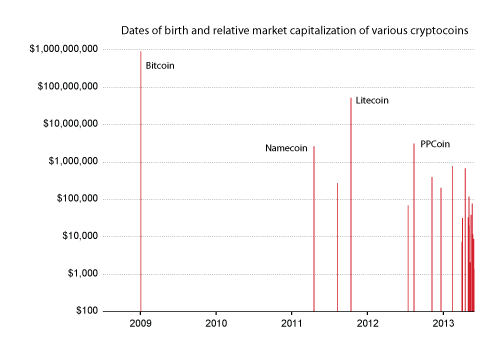
I'm sure that chart nerds will accuse me of unnecessarily using a circle chart. The areas of circles are not as easily compared by our eye as, say, lines with differing heights. A quick glance immediately picks up height differentials -- it takes more effort to pick out area differentials. Far better would be to use a chart like this:

The logarithmic scale in the above line chart adds resolution by rendering each alt-coin's bar more comparable to what would otherwise be a humongous bitcoin bar. If I had time, I'd allow the user to zoomover the busy part in 2013. The problem with this chart is that the lines get jumbled together when the births of new coins comes in bunches. In this respect, the circle chart is superior to the line chart since it can easily handle simultaneous births by overlaying the circles one on top of the other.
The other problem with my line chart is it really doesn't convey the sheer size of bitcoin. I think the circle chart is pretty successful in this respect. The blue dot that represents BTC is virtually spilling off the page. When I came up with the design for the circle chart, I was thinking about the chart below:

Bitcoin is like the sun. The alternatives are still wimpy planets.
Comments
Post a Comment